Overview
The what
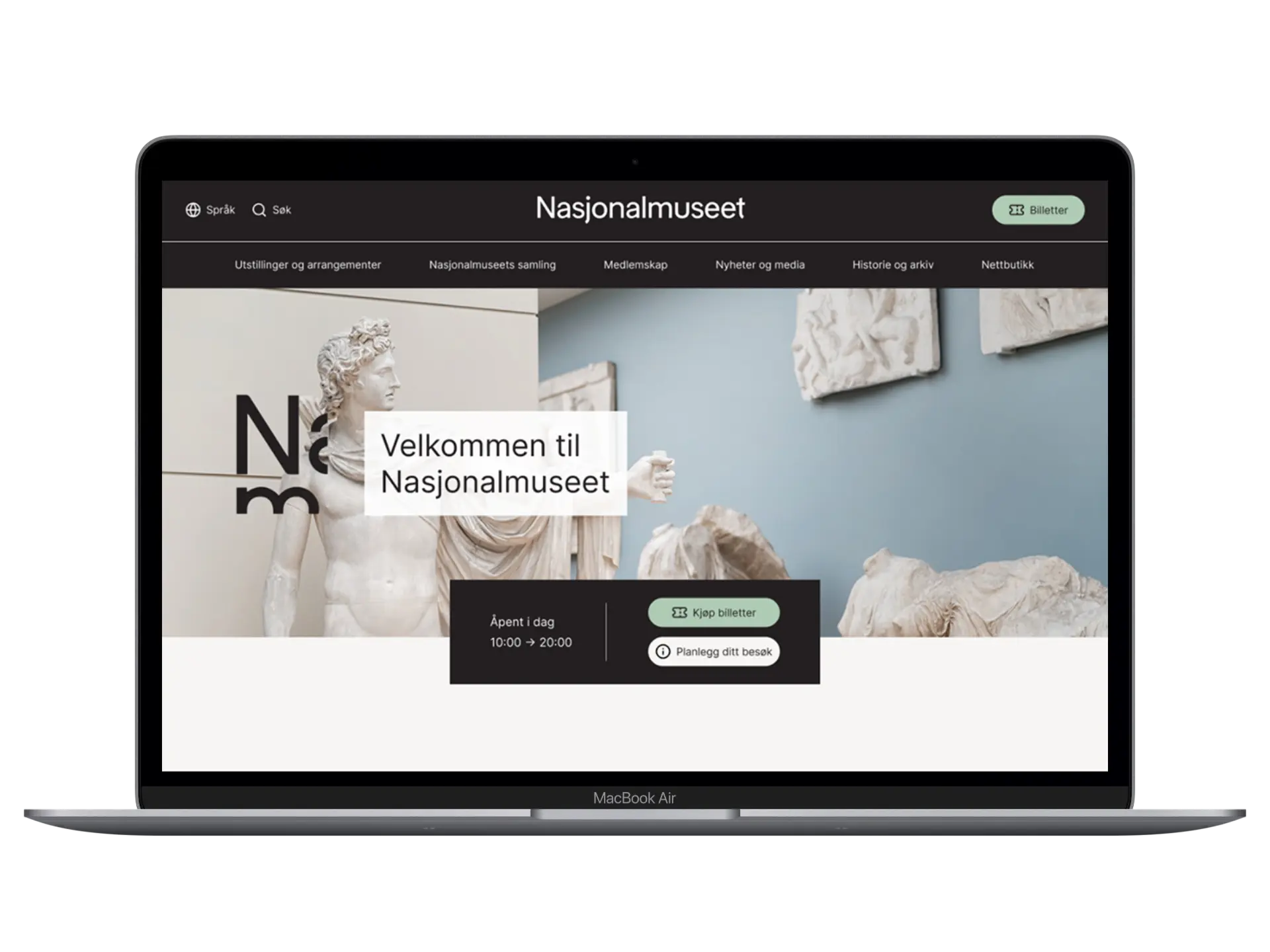
This school project focused on analyzing and improving the information architecture for the National Museum's website. The main objective was to reorganize the structure of the museum's collection, which includes over 50,000 artworks, to enhance user navigation and accessibility for art enthusiasts and casual browsers alike.
The why
With a vast collection and a complex website, users often faced challenges in finding relevant content. The project aimed to simplify the user experience, ensuring that visitors can easily explore the collection and find information efficiently. The goal was to create a more intuitive and user-friendly structure that aligns with universal design principles.
The how
Using research methods such as user testing, card sorting, and tree testing, we developed a new strategic structure for the website. The process involved creating personas, mapping user journeys, and designing both low and high-fidelity prototypes. The final solution was delivered as an interactive prototype, style guide and component library.
Research & Insights
To inform our design decisions, we conducted multiple research methods to understand user needs and identify key areas for improvement. This ensured that our solutions were grounded in real user behaviors and preferences, rather than assumptions.
Field Study
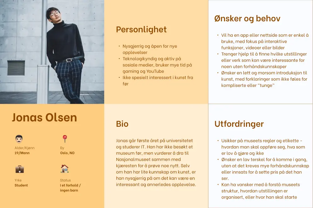
We performed a field study at the National Museum, observing visitor demographics to identify three primary user groups: art students, senior art enthusiasts, and tourists. This observation aided us in creating relevant personas for our design process.
Media Coverage & Reviews
Media coverage and visitor statistics confirmed the museum's broad appeal to locals and tourists alike. By analyzing TripAdvisor reviews from the museum's 2022 reopening, specifically the 1-star and 5-star ratings, we uncovered revealing patterns: negative reviews frequently mentioned missing practical information (such as dress code requirements), while positive reviews celebrated iconic artworks like "The Scream."
Competitor Analysis
We explored other museums' websites to study existing solutions, focusing on identifying effective design elements and navigation methods. Among other aspects, we examined menu structures, such as open versus closed menus, as well as content organization and overall site navigation. These analyses gave us some inspiration and ideas for the prototype process.
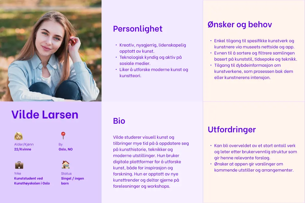
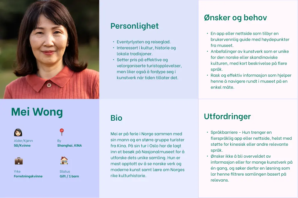
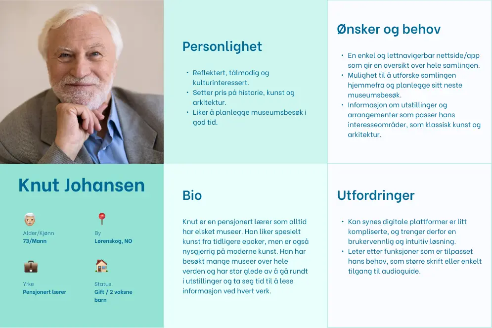
Personas
Personas help us understand and represent different user groups by creating fictional characters based on real user research. This method ensures our design decisions address specific needs and pain points rather than assumptions.
In our case, we selected three personas based on our research: an art-interested student, a retiree, and a tourist. Later in the process, we recognized the need to include a new target group: first-time visitors with limited knowledge. This addition was prompted by our observation of an increasing trend on social media of younger people visiting museums despite having little prior experience with such institutions.
These personas represent different user groups with varying expectations and needs, providing insights on how to improve the museum's website. For example, art enthusiasts might prefer filtering artwork by detailed characteristics, while first-time visitors may appreciate suggested highlights and seek practical information about dress codes, etiquette, and behavioral guidelines.
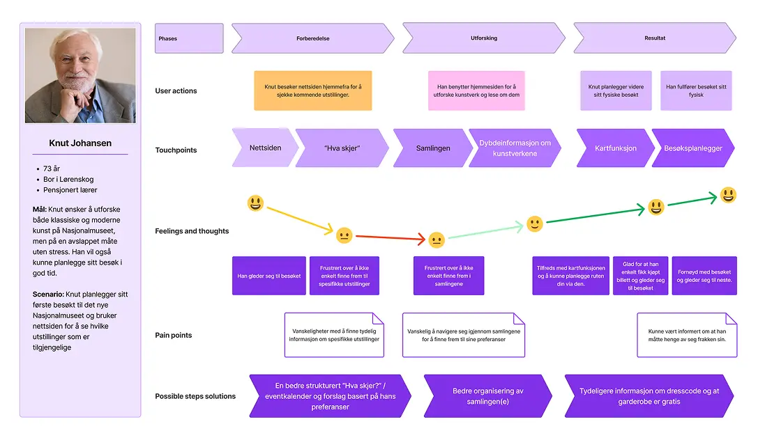
User Journey Maps
We created user journeys for each persona, all with distinct goals, expectations, and challenges. The journeys are based on scenarios where users interact with the museum's website, illustrating how we can enhance both strategic and visual aspects of the user experience.
Each user journey focuses on specific phases, touchpoints, emotions, pain points, and potential solutions. This provides us with a comprehensive understanding of how to adapt the museum's digital platform to meet diverse needs and improve the overall visitor experience.
Content Inventory/Audit
By creating a content inventory/audit, we got a clear overview of all the website's content. This helped us decide what to keep, change, update, or remove. We kept the overview at a high level so it wouldn't become too complex.
We then did two exercises: first, we ranked content based on importance and relevance to our target groups. Ticket sales, upcoming exhibitions and events, and visit information (opening hours and location) ranked high due to their significance for visitors.
In the second exercise, we grouped related content together. This helped us see which content should be shown together and organize information better. For example, we found that ticket sales and visit information should be placed near each other, since both are essential for visiting the National Museum.
Card Sorting
In card sorting exercises, participants group navigation items into logical categories. This helps us understand how users think content belongs together, adding real user perspectives to complement our content inventory work.
Open card sorting: Three participants worked individually to group items and create their own categories.
Closed card sorting: One participant then sorted the same items using categories created by the other two. This helped us compare different approaches.
Key findings:
- "Museum shops" created uncertainty: was this about physical stores, the online shop, or both? This needs clarification to avoid confusion.
- Different mental models: participants created 4, 5, and 8 categories respectively, showing that people organize information differently. Some prefer broad categories while others want more detailed options.
- Hard-to-place items: some content didn't fit naturally into any category, suggesting we might need to adjust our structure or merge some pages.
- Overly broad categories: categories like "Practical info" became dumping grounds for too much content. While some users prefer general categories, they still need to clearly indicate what's inside.
Tree Testing
The purpose of the test was to have participants navigate through the website's navigation structure, including all subcategories. This gave us valuable insights into which categories or items they found difficult to find. The results helped us identify areas that needed improvement to make navigation more intuitive and user-friendly.
We set up the tree-jack test in the digital testing platform "Optimal Workshop". This tool allowed us to create specific tasks for participants to complete. We tested with five participants in total.
Based on the results, we concluded:
- Users reached their goals but made mistakes along the way. This suggests the navigation could be more intuitive.
- The categories might seem a bit too general, and should be made clearer.
Design Process
In this phase, we created a low-fidelity prototype based on our research insights and tested it with users. This iterative approach allowed us to validate our assumptions and gather real feedback before investing time in more detailed design.
Low Fidelity Prototype
To begin the lo-fi prototype process, three team members each created their own version of the homepage and collection subpage. This approach generated different ideas and visual layouts, which we then combined into one unified lo-fi prototype.
Our final lo-fi prototype focused on the essential pages: homepage, collection database, collection information (the exhibition), tickets, and exhibitions and events.
On the homepage, we emphasized creating a consistent and recognizable layout to simplify navigation. Our personas revealed the importance of a website where users can quickly find information. We therefore designed a clearer menu structure, which is essential for helping people navigate and locate what they need.
We placed the most important links outside the main menu for easy access, while grouping less essential links in a menu. This lets users quickly reach key subpages and creates a cleaner structure for handling numerous pages.

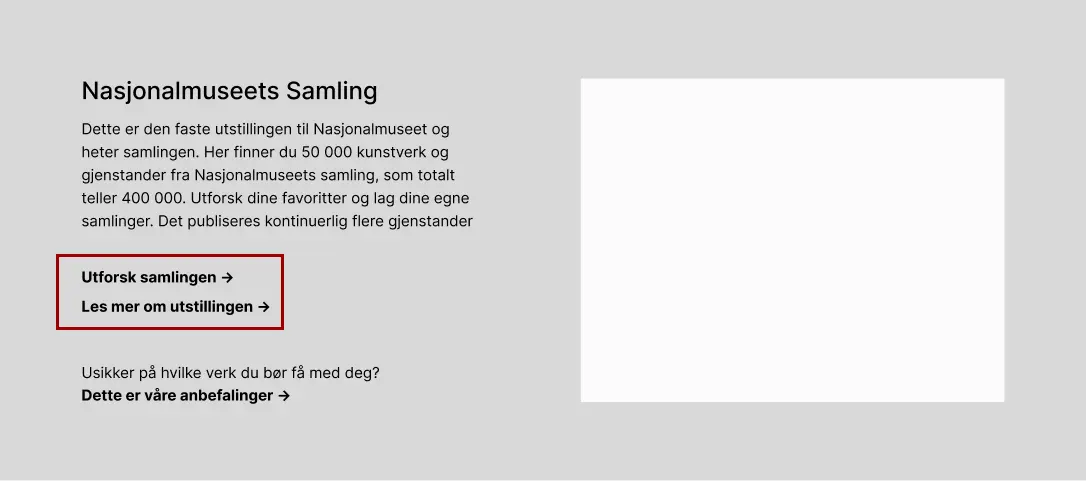
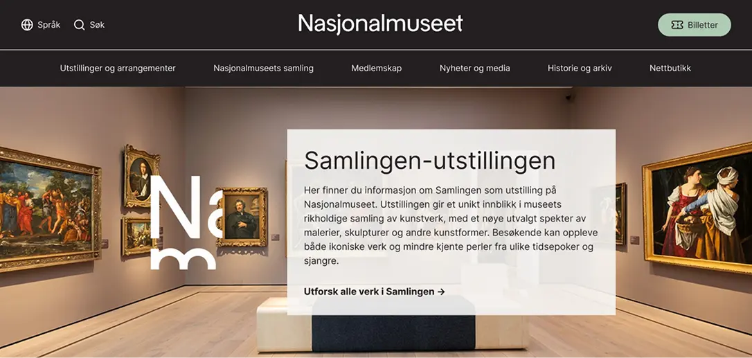
Initially, we found it confusing to distinguish between the collection as a database of artworks and the collection as a physical exhibition at the museum. Since several team members hadn't visited the website before, we realized this could challenge other first-time visitors too. This issue also emerged in our card sorting exercises.
To clarify this distinction, we created a dedicated section on the homepage for the National Museum's collection. It contains links to both "explore the collection" and "read more about the exhibition". We wanted to test whether this would reduce confusion and improve navigation.
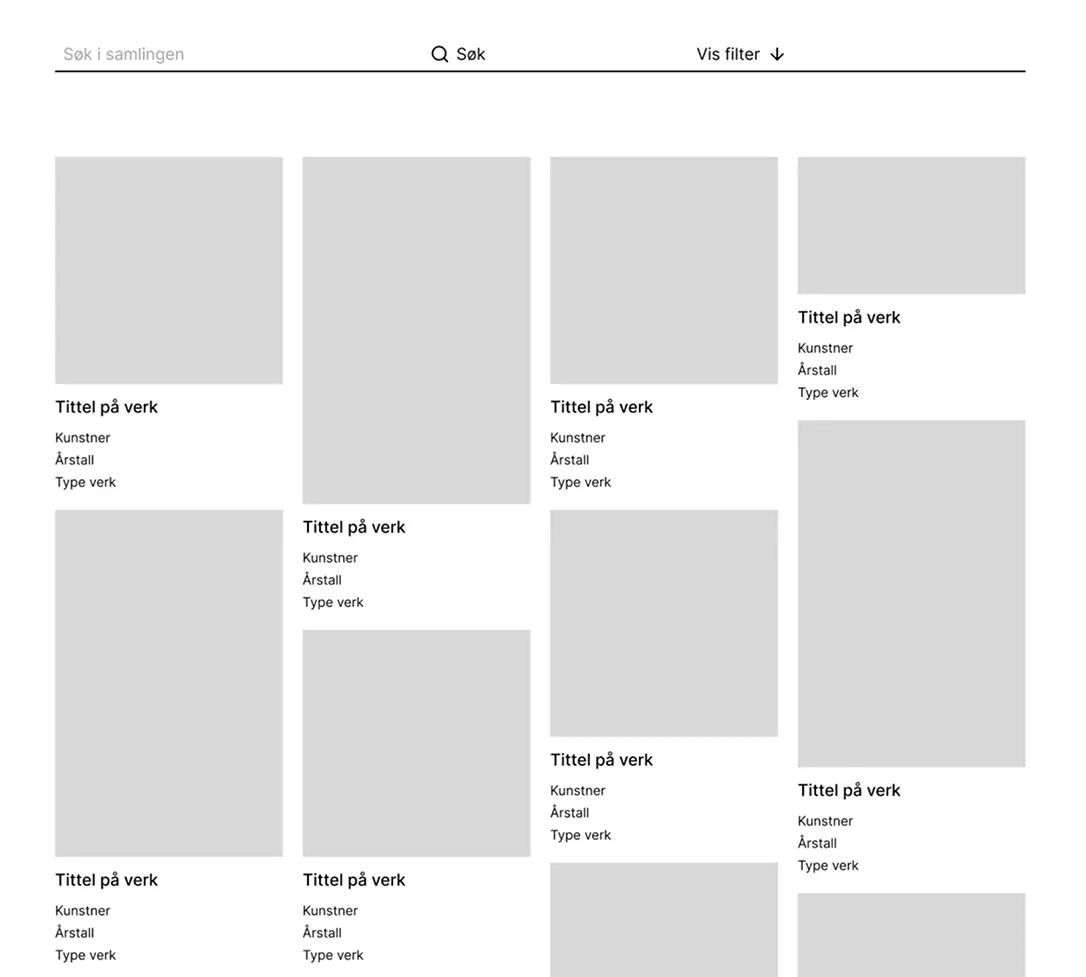
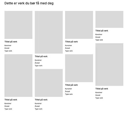
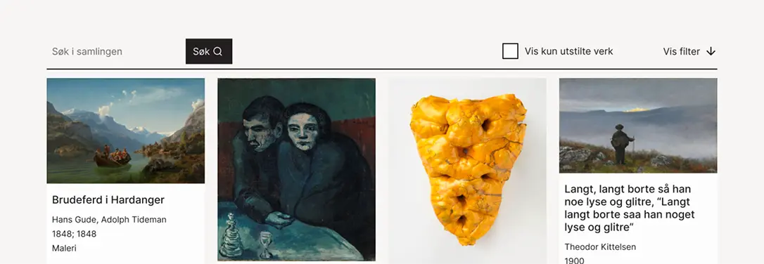
Based on our personas' needs, a well-structured organization of artworks in the Collection was crucial. While the current display of artworks was acceptable, distracting elements like works grouped in "themes" and user-created collections made it seem cluttered and confusing. We removed these features but kept the basic structure and layout.
We also wanted to highlight the filtering option, so we placed the filter function next to the search field to make it more noticeable and accessible for users searching for specific information.
Based on our target audience of first-time visitors, we included a section with recommendations of must-see artworks. This provides guidance for visitors who may lack prior knowledge and helps them plan their visit more easily. This was added to the page about the Collection as an exhibition. To ensure a cohesive experience, we maintained the same layout as the Collection database.
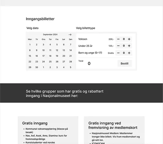
We also wanted to test whether consolidating all ticket information on one page would be effective. The National Museum's current solution has a separate subpage for "see which groups have free and discounted admission". Our reasoning was that the National Museum's website contains numerous subpages, which can make navigation challenging for users.
User Testing
We conducted three user tests. To gather some background information, we started with brief questions about the users, such as their relationship with museums and whether they had previously visited the National Museum's website.
The main part of the test consisted of nine tasks where participants had to navigate to specific content or information on the website. Examples of tasks included "You want to find information about and purchase tickets, what do you do?" and "You want to find information about exhibitions during a weekend when you're free, what do you do?". They were encouraged to think aloud during the process.
The user tests yielded diverse feedback, but there were some recurring themes:
- The navigation structure needed clarity, as it was confusing with two "elements": links presented side by side and a hamburger menu.
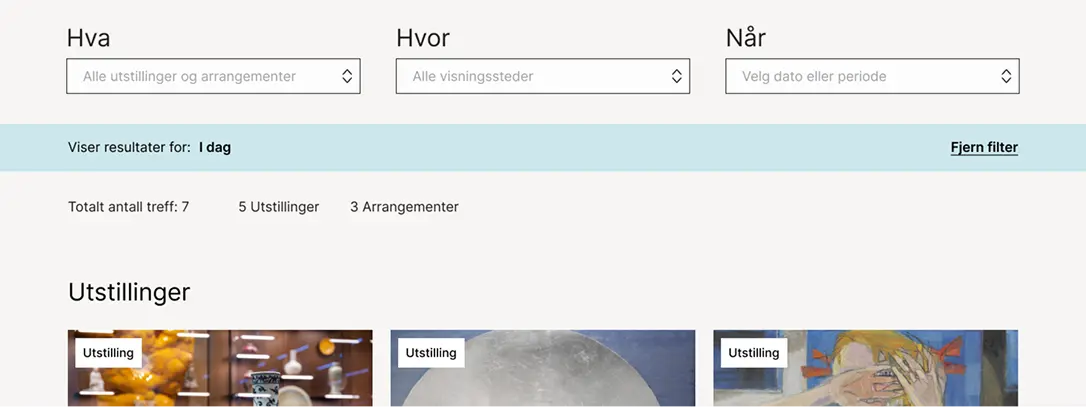
- On the "exhibitions and events" page, users wanted immediate filtering options and date selection.
- There was still some challenges in understanding the difference between the Collection as a database versus the collection as a physical exhibition at the museum, and what is actually displayed at the museum.
- Users suggested that ticket booking functionality should appear earlier in the user journey.
- They noted that some areas presented too much information simultaneously, particularly regarding discounted prices, making the page feel overwhelming.
The Final Design
The high-fidelity prototype addresses several of the key issues we identified. It presents a more intuitive solution that meets the diverse needs of our target audiences while effectively showcasing the museum's collection.
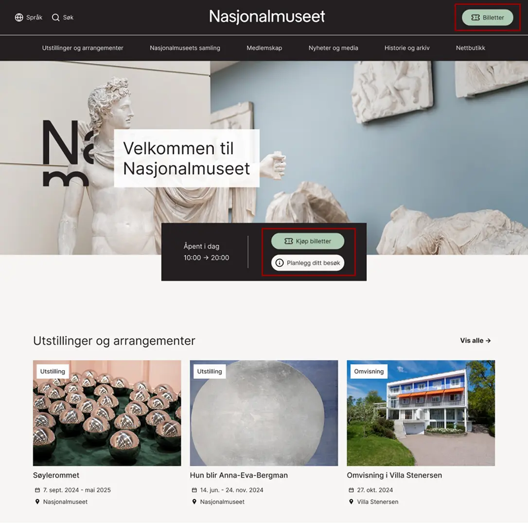
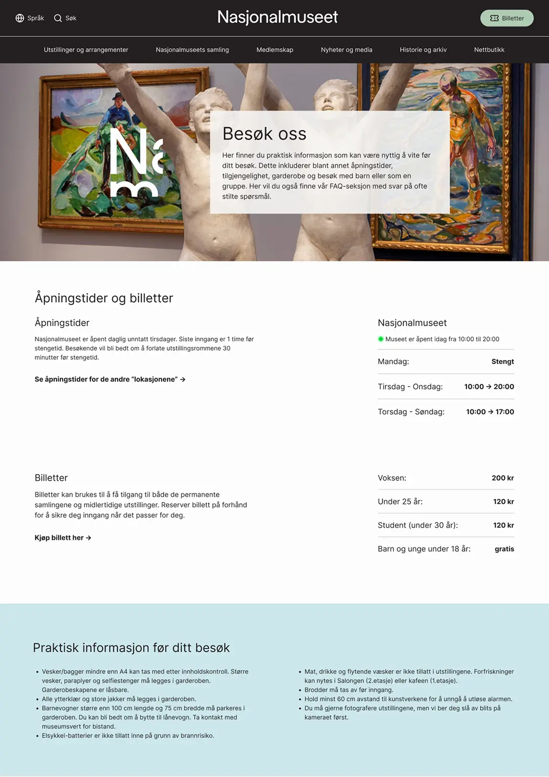
We aimed to preserve the National Museum's existing visual expression. Among other design choices, we used sharp corners on elements like boxes and buttons to reflect the National Museum's current visual expression. At the same time, we incorporated rounded corners on important CTA buttons, such as "buy ticket," to make these elements stand out. We also maintained the museum's existing color palette, though their site has since been redesigned after our project was completed.
Based on user testing feedback that the menu and navbar were confusing, we made some changes. We removed the hamburger menu and created a navbar with only the most essential links based on our assessment.
On the homepage, we chose to keep two CTA buttons (ticket buttons), even though this might affect the visual hierarchy. User testing feedback supported this decision, as both buttons were utilized. This suggests they serve different needs and navigation patterns.
We considered whether to include images behind text in the hero sections on various pages. We decided to use images but added a box behind the text to ensure good contrast and readability. The exception is the Collection database page, where we chose not to use images to avoid drawing attention away from the artworks presented there.
Through both user testing and research, including insights from personas, we uncovered a clear need to see which artworks are displayed in the museum. This was highlighted as important for making it easier to plan visits. To address this need, we implemented a feature that allows users to filter "show only exhibited works." This function was placed outside the filtering menu to ensure easy accessibility. The search button was also made clearer based on feedback that it was somewhat unclear in the lo-fi prototype.
An important finding from user testing was the need for quick access to filters for exhibitions and events. Therefore, this section was moved higher up to make it more visible and immediately accessible to users.
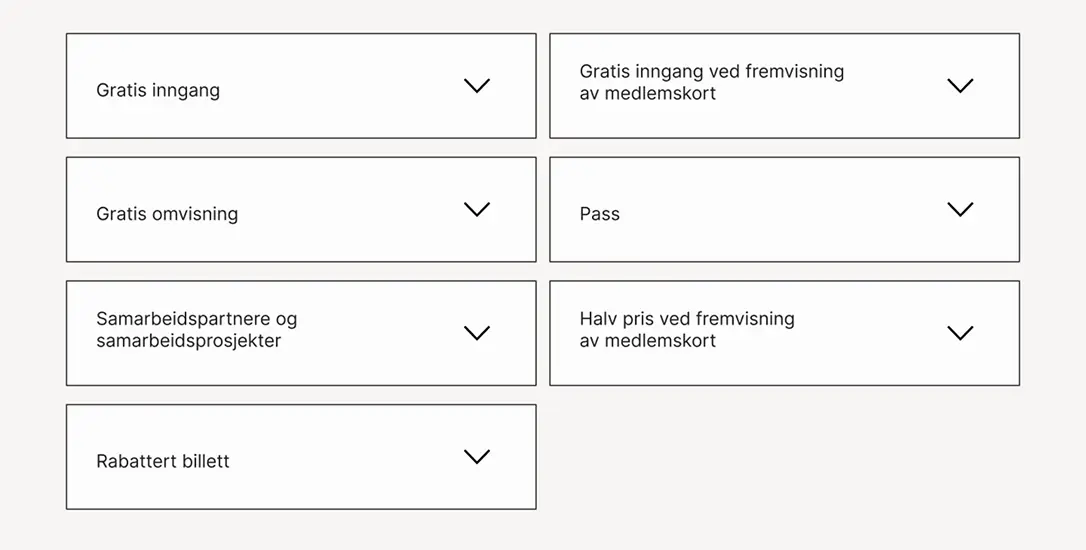
On the ticket page, we received feedback that the information presentation was overwhelming. To address this, we placed much of the information in dropdown menus. This gives users a cleaner experience while keeping all relevant information easily accessible when needed.
The "Visit Us" page wasn't user-tested as it wasn't part of the lo-fi prototype. It was designed based on insights from the research phase of the project. Here, it was clear that practical information needed to be highlighted and better structured to meet user needs. Practical information such as dress code, cloakrooms, rules and etiquette at the museum was included to give visitors a clear understanding of what to expect and how to prepare.
The National Museum's website required multiple clicks and extensive back-and-forth navigation. We chose to consolidate most information on a single page to simplify navigation.
Reflections
This project has given me valuable experience in structuring and improving complex digital systems. The process has been both challenging and educational, providing deeper insights into information architecture and user experience. One of the biggest challenges was balancing the website's complexity with the need for user-friendly navigation. User testing also highlighted the importance of continuous iteration and feedback.
If we had more time, we would have prioritized:
- Developing a more comprehensive and detailed prototype that included additional pages and features.
- Conducting further testing, especially of pages like "Visit Us" and the ticket system, to ensure the solutions work properly.
- Addressing more of the challenges that emerged during the research and insight phase, such as a more optimized solution for international tourists.